


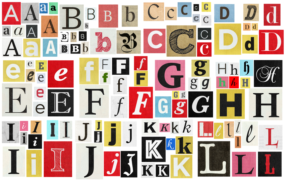
Typography in Logo Design: Dive deep into how font choices can make or break a logo
Posted by Naji Jr. on to Technical Guides
Typography in Logo Design: Dive deep into how font choices can make or break a logo
Introduction
In the intricate tapestry of branding, few elements hold as much sway as typography. It’s more than just letters and words; it's an art form that conveys emotions, personality, and brand values. A well-chosen font can elevate a logo to iconic status, while a poorly chosen one can detract from a brand's intended message. At LogoUp, we don’t just provide custom embroidered and screen-printed apparel, we weave stories, and typography is one of our most potent threads. In this comprehensive guide, we'll delve into the pivotal role of typography in logo design and why font choices can truly make or break a logo.
The Power of Typography
1. Conveying Brand Personality: Every font carries an inherent mood and sentiment. Think of fonts as the different outfits a person might wear - some are casual, some professional, some quirky. A playful startup targeting children might gravitate towards a bubbly, rounded font, encapsulating youthfulness and fun. In contrast, a high-end luxury brand would lean towards a sophisticated serif, exuding elegance and timelessness. This goes beyond mere aesthetics; it's about aligning the typography with the very ethos of the brand, ensuring that every letter resonates with its intended voice and tone.
2. Creating Lasting Impressions: In a world saturated with logos and brands vying for attention, standing out is paramount. The right typography can be the distinguishing factor. A unique font, when aligned with the brand's identity, becomes an anchor, making the logo memorable and instantly recognizable. It's about creating a visual imprint that lingers in consumers' minds, prompting them to recall and reconnect with the brand.
3. Ensuring Readability: While artistic flair is essential, functionality cannot be sidelined. A logo's primary job is communication. If a consumer struggles to read or comprehend it, the logo fails in its primary objective. Typography needs to be crystal clear across all touchpoints, be it the minuscule size on a business card or the magnified version on a billboard. Clarity ensures that the brand's message is unambiguously conveyed, regardless of the medium.
Factors to Consider When Choosing Fonts
1. Brand Image & Values: Typography is not a one-size-fits-all solution. The chosen font must be a mirror reflecting the brand's soul. A tech startup, for instance, might choose a sleek, minimalist font, signaling innovation and forward-thinking. Meanwhile, a heritage brand with a rich history would likely select a traditional font, resonating with its legacy. Every curve, line, and space in the typography should harmonize with the brand's values, mission, and overall narrative.
2. Target Audience: A brand's audience is its compass, guiding many of its decisions, including typography. If a brand caters to a younger, hip audience, it might lean towards modern, bold fonts, resonating with contemporary tastes. Conversely, a brand targeting professionals or an older demographic would benefit from classic, understated typography, exuding reliability and maturity. By understanding and resonating with the audience's preferences, brands can foster deeper connections and engagements.
3. Versatility: In today's multi-platform world, a logo will appear in numerous places - from mobile apps to websites, to physical products, and apparel like the offerings at LogoUp. Hence, the chosen typography should be adaptable. It should retain its charm, whether it's embroidered on a shirt or displayed on a digital billboard. Consistency across platforms not only strengthens brand recall but also ensures that the brand's essence remains undiluted, irrespective of the medium.
Typography is more than just choosing a "pretty font". It's a strategic decision, underpinned by a deep understanding of the brand and its audience. It's an art and a science, weaving together aesthetics and functionality to create logos that are both captivating and communicative.
Common Typography Pitfalls
1. Overcomplicating Things: In the pursuit of uniqueness, some brands venture too far into the realm of decorative fonts, thinking complexity equates to distinction. However, more often than not, simplicity is the cornerstone of effective communication. A clean, straightforward type ensures that the message is conveyed without barriers. In contrast, overly intricate lettering can be a deterrent, making customers expend unnecessary effort just to decipher the brand name.
2. Following Fleeting Trends: Trends come and go; they're transient by nature. While hopping on the latest typography trend can provide a temporary boost in appeal, it risks dating the brand in the long run. The key is to strike a balance—being aware of modern design sensibilities but opting for a font that encapsulates the brand's essence and stands the test of time.
3. Not Considering Scalability: Logos are versatile entities. They might adorn the header of a website, the corner of a business card, or the chest of a T-shirt. Ensuring that the typography remains crisp, clear, and legible across all scales is paramount. Especially when transitioning to tangible mediums like embroidery or screen printing, the clarity of each letter matters. At LogoUp, we've mastered this art, ensuring every logo, regardless of its size, communicates effectively and maintains its visual appeal.
Typography and LogoUp: Crafting Unforgettable Narratives
In the realm of branding, logos are more than mere symbols; they're storytellers. Every curve, line, and space within a logo's typography adds a chapter to this narrative. At LogoUp, we've always championed this philosophy.
Understanding the nuances of typography allows us to ensure that every embroidered shirt or screen-printed promo item serves as a brand ambassador. When a logo is displayed on a piece of apparel, it's not merely about aesthetics; it's a testament to the brand's ethos, its values, and its promise to its customers.
The precision and care we apply in adapting logos to various mediums is rooted in our respect for the power of typography. It's not just about reproducing an image; it's about translating a brand's voice into a visual format that speaks volumes.
While the world of typography is vast and varied, its core principles remain constant: clarity, authenticity, and resonance. Brands that navigate these waters with a keen sense of purpose, backed by expertise (like that offered by LogoUp), find themselves armed with logos that do more than just identify—they inspire.
Conclusion
Typography is a silent communicator in the world of branding. It can subtly convey messages, evoke emotions, and define a brand's identity. As brands continue to vie for attention in a saturated market, the nuanced art of typography in logo design becomes ever more crucial. At LogoUp, we've woven this understanding into our core, ensuring that every piece of apparel or promo product we craft is not just a promotional item but a storyteller, echoing the brand's narrative through every thread and print. Because, in the end, it's not just about the font you choose; it's about the story it tells.
Categories
Recent Posts
- The Best Custom Polos for Workwear and Events
- The Most Popular Custom Hats for Every Occasion
- Why Choose a Mesh Back Hat?
- Exploring Backstrap Options: The Benefits and Drawbacks of Popular Hat Closures
- The Perfect Pair: Branded Bills Hats for Embroidery
- Trendy Camo Hats for the Outdoors: Customize the Richardson 111P with LogoUp
- The Ultimate Guide to Customizing the Richardson 320 Washed Chino Hat with Embroidery
- Embroidery on the Otto Cap 39-165: High-Performance Customization for Every Occasion
- LogoUp Holiday Gifts: Embroidered and DTF-Decorated Richardson 112, 112PFP, and 112PM
- Gifting LogoUp Custom Campfire Mugs: Thoughtful, Versatile, and Personalized


Add Comment