


Maximizing Impact: Color Choices in Embroidery and Screen Printing
Posted by Naji Jr. on to Technical Guides
Maximizing Impact: Color Choices in Embroidery and Screen Printing
In the bustling world of apparel design, two techniques have stood the test of time – embroidery and screen printing. While design intricacies and material choices play their roles, the real game-changer is often color. Making the right color choices can set the tone, communicate a message, and above all, ensure your design grabs attention. In this comprehensive guide, we'll explore how the art of color selection in embroidery and screen printing can maximize your brand's impact.
Delving Deeper into the Color Wheel and Design
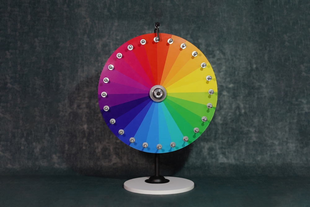
In the intricate realm of design, the color wheel stands as an enduring tool, guiding designers in their quest for visual harmony. An understanding of this wheel, with its vivid spectrum of colors and the theories it encapsulates, is vital. It provides a strategic framework, helping designers harness the power of colors to craft compelling and memorable designs.
The Structure of the Color Wheel
The color wheel is a circular diagram that represents the relationships between different colors. At its core are three categories:
- Primary Colors: These are the foundational colors that cannot be formed by mixing others. They include red, blue, and yellow. These colors are the pillars upon which all other colors stand.
- Secondary Colors: When you mix two primary colors, the resulting shades are termed secondary colors. They are green (blue + yellow), orange (red + yellow), and purple (red + blue).
- Tertiary Colors: These are the offspring of a primary color and its adjacent secondary color. Examples include red-orange (a mix of red and orange) and blue-green (a mix of blue and green).
Strategic Color Schemes for Impactful Designs
The color wheel isn't just a representation of colors; it's a guide to combining them effectively. Here's a deeper dive into the three primary color schemes:
- Complementary Colors: These pairs, sitting opposite each other on the color wheel, offer the highest contrast. Their innate differences make designs pop, catching the viewer's eye. For instance, the vivacity of red paired with the calming serenity of green can create a balanced yet striking design. Similarly, the coolness of blue juxtaposed with the warmth of orange offers a delightful visual treat.
- Analogous Colors: Analogous schemes are all about harmony. By choosing colors that sit side by side on the wheel, designers can craft compositions that are soothing and cohesive. This scheme is akin to nature's palettes – think of the gradations in a sunset or the varied greens in a forest. Using blue, blue-green, and green together, for instance, can evoke feelings of tranquility and depth.
- Triadic Colors: For those seeking a vibrant yet balanced design, the triadic scheme is a boon. Picking three colors equally spaced on the wheel provides a harmonious diversity. A classic example is the primary colors themselves – red, blue, and yellow. When used together, they offer an energetic and dynamic appeal, without overwhelming the viewer.
The Emotional Undertones of Colors
Beyond the mechanics of the color wheel, it's crucial to recognize the emotional resonance of colors. Each hue carries with it a set of feelings and associations. Blues might evoke feelings of calm and trust, while reds can stir passion and urgency. Tapping into these emotional undercurrents can enhance the effectiveness of designs, ensuring they resonate deeply with the audience.
By deeply understanding the color wheel, designers can navigate the vast sea of color possibilities with confidence. It's not just about selecting shades that look good together; it's about choosing colors that convey the right message, create the desired emotion, and ultimately, bring the design to life.
Embroidery: Crafting Vivid Narratives Through Threads and Colors
Embroidery stands tall as a testament to the blend of tradition and innovation. With its textured allure, it offers unparalleled depth and detail, transforming even simple designs into intricate works of art. Choosing the right hues can mean the difference between a design that fades into the fabric and one that captivates and commands attention.
The Magic of Layering and Shading
The meticulous art of embroidery is much like painting, but with threads instead of brushes. Through strategic layering and shading:
- Gradient Wonders: Creating gradient effects by seamlessly transitioning from one color to another offers designs a dynamic, fluid quality. This gradient, achieved by layering threads, can add depth, transforming flat designs into multi-dimensional masterpieces.
- Shadow Play: Proper shading can give the illusion of light falling on the design, adding a real-world feel. Subtle variations in thread shades can create shadows, adding depth and making embroidered designs more realistic and visually appealing.
The Luxurious Touch of Metallic Threads
In the world of embroidery, metallic threads are akin to the jewelry of fabrics:
- Lustrous Elegance: Incorporating threads in shimmering gold, silver, or bronze can elevate a design instantly. Their reflective nature interacts with light, ensuring that the embroidered piece catches the eye, whether it's on corporate logos or ornate motifs.
- Symbolism: Beyond their visual appeal, metallic colors often carry symbolic weight. Gold can be associated with excellence, silver with sleek sophistication, and bronze with a sturdy legacy. Brands can use these threads to convey specific values or sentiments through their designs.
Harnessing the Power of Contrast
Embroidery's tactile nature can be accentuated by playing with contrast:
- Bold Choices: Opting for thread colors that starkly contrast with the base fabric ensures that designs don't just blend in but rather, leap out. This pronounced contrast can amplify the three-dimensional quality of embroidery, making designs more engaging.
- Subtlety in Design: It's not always about being bold. Sometimes, a subtle contrast can create an elegant, understated effect. Light embroidery on a slightly darker fabric, for instance, can be ideal for designs meant to exude sophistication without being overly flashy.
Embroidery, with its myriad possibilities, offers designers a canvas to weave stories in threads and colors. The choice of colors, their interplay with fabric, and the techniques used can transform a piece from being just clothing to a narrative. By understanding the nuances of embroidery and the potency of colors, brands can create designs that resonate deeply, reflecting their ethos and captivating their audience.
Screen Printing: Crafting a Visual Feast with Color
Diving deep into the world of screen printing is akin to entering an orchestra where each color plays its unique note, creating a harmonious visual symphony. This age-old technique, known for vivid representations, provides artists and brands a vast canvas to showcase their creativity.
The Nuances of Ink Opacity
The right ink can make or break your design, especially in screen printing:
- Understanding Fabric Dynamics: Different fabrics absorb inks differently. For instance, a thicker fabric like cotton might hold onto the ink more than a slippery one like polyester. Recognizing these dynamics is the first step to achieving the desired color output.
- Underbases in Action: Light inks on dark fabrics can appear washed out. An underbase, typically a layer of white ink, is printed first to ensure the true vibrancy of the color pops. This strategy can particularly uplift designs on dark apparels, ensuring they remain true to the artist's vision.
The Magic of Halftones
Screen printing's ability to utilize halftones revolutionizes design possibilities:
- Shading Perfection: With halftones, transitioning between shades becomes seamless. This is especially beneficial for designs that require realistic shading or a gradient transition, like a sunset scene.
- Capturing Photorealism: Photographs or designs that rely heavily on subtle color shifts can be replicated on fabric using halftones, opening a world of possibilities for artists and brands.
Embracing the World of Color Overlays
Layering is an art in screen printing, and it extends beyond just designs:
- Blend and Discover: Translucent inks, when overlaid, can result in an unexpected yet delightful new color. A yellow over a blue might give you that perfect shade of green you've been looking for, offering a broader palette without needing dozens of ink pots.
- Depth and Dimension: Using overlays, especially with varied transparency levels, can add depth to a design. This is ideal for creating illusions, playing with shadows, or just adding a multi-dimensional feel to a straightforward design.
Screen printing is a dynamic space, with colors at its heart. Every choice, from the type of ink to the technique of layering, impacts the final result. And in this vibrant realm, understanding and mastery of color dynamics can be the distinguishing factor between a good design and an unforgettable one. Brands and artists, by harnessing these nuances, can create apparels that not only showcase designs but also tell tales of craftsmanship and attention to detail.
Color Strategy: Guiding Brands in Their Chromatic Journey
When it comes to brand representation, every element, from the logo shape to the color palette, plays a critical role. Colors don't just add aesthetic value; they also communicate a brand's ethos, establish recall value, and influence audience perception. Making informed color decisions is hence paramount.
Staying True to Brand Identity
Consistency is the key to strong branding. To create a cohesive brand image:
- Consistent Palette: Having a consistent color palette across all branding efforts, from websites to merchandise, helps create a recognizable and trustworthy brand image.
- Evolution, Not Revolution: While it's essential to occasionally refresh brand colors to prevent them from becoming dated, any changes should be gradual and in line with the existing palette. This ensures that long-standing customers still feel connected to the brand, while new audiences appreciate its modern outlook.
Deciphering Color Psychology
Colors, beyond their visual appeal, carry emotional weight. Understanding this can give brands an edge:
- The Emotion Spectrum: Different hues evoke varied feelings. For instance, while cool colors like blue and green can instill a sense of calm and trustworthiness, warm shades like red and orange might ignite feelings of excitement and energy. Making informed choices based on these emotional responses can enhance brand resonance.
- Cultural Nuances: It's essential to recognize that color perceptions can vary across cultures. For a global brand, what's auspicious or positive in one culture might not be perceived similarly in another. A comprehensive understanding of these nuances can lead to a more inclusive and effective color strategy.
Riding the Wave of Color Trends
Staying updated with trends while keeping the brand essence intact can strike the right balance:
- Being Trend-aware: While it's not always necessary to revamp brand colors based on every fleeting trend, being aware of dominant color waves can help brands stay relevant. Incorporating trending colors in seasonal campaigns or limited-edition products can be an effective strategy.
- Influential Color Forecasts: Established color authorities, like Pantone, often dictate the mood for the design world with their forecasts. These can be insightful not just for predicting trends but also for understanding the socio-cultural factors influencing these color shifts.
Color is a powerful tool in a brand's arsenal. It's not merely about aesthetics; it's about weaving narratives, evoking emotions, and building connections. Brands that understand and harness the potency of colors, keeping in tune with their identity and the world around them, set themselves up for lasting impact and resonance with their audience.
Conclusion: The Power of Color in Design
In the realms of embroidery and screen printing, design and color go hand in hand. The right color choices can elevate a design, making it memorable and impactful. As brands or designers, understanding the nuances of color in these techniques can be the difference between a design that's good and one that's truly great. Whether it's the sheen of a metallic thread in embroidery or the vibrant spread of ink in screen printing, every color choice counts. So the next time you're on the design board, remember - color is not just a visual element; it's an emotion, a statement, and above all, a powerful tool of communication.
Categories
Recent Posts
- The Best Custom Polos for Workwear and Events
- The Most Popular Custom Hats for Every Occasion
- Why Choose a Mesh Back Hat?
- Exploring Backstrap Options: The Benefits and Drawbacks of Popular Hat Closures
- The Perfect Pair: Branded Bills Hats for Embroidery
- Trendy Camo Hats for the Outdoors: Customize the Richardson 111P with LogoUp
- The Ultimate Guide to Customizing the Richardson 320 Washed Chino Hat with Embroidery
- Embroidery on the Otto Cap 39-165: High-Performance Customization for Every Occasion
- LogoUp Holiday Gifts: Embroidered and DTF-Decorated Richardson 112, 112PFP, and 112PM
- Gifting LogoUp Custom Campfire Mugs: Thoughtful, Versatile, and Personalized


Add Comment